Case Study: BikeTag Case Study
Conducted by:
Lisa Zampogna
Tools
Figma, Figjam, Zoom, Google Suite, Pages, Numbers, Keynote, Photoshop
Skills / Services
Usability evaluation, Cognitive Walkthrough, Contextual inquiry, Task analysis, User Stories, Prototyping
ROLES
Research, Evaluation, Interviews
LOCATION:
Twin Cities
Purpose:
Evaluate the usability of BikeTag's existing design for its web app, conduct user research and create a prototype to improve the usability and experience for users.
Summary
Project Overview And What I Learned
The game BikeTag excites users to get outside, explore their city and have bit of fun along the way. Each players races to find the current hidden location and then to a second location to set the new hidden point.
The current version of the app served its users' needs, but there were some opportunity areas we discovered through our research using a cognitive walkthrough and primary user research.
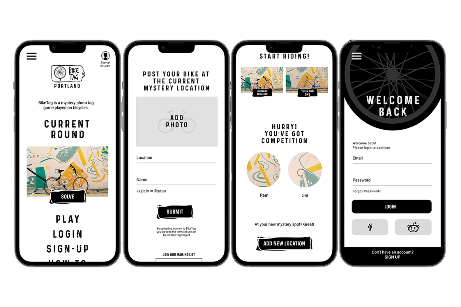
I addressed some of the friction by removing a few of the steps required by the current design for users to submit their two photos for game play. Additionally, I added the ability to set up an account, maintain a profile and seamlessly share updates to social media platforms.
If we had had more time on this project I would have tested our new wireframes with users and extended the program to include features such as: an admin panel to allow for modification of local rules, edits of post and newsletter settings.
I would also research the interest and need for an option to login through 3rd part accounts, as well as allowing email only logins with options to post social media handles and simple profile tag lines, profile photo, etc.
Overview
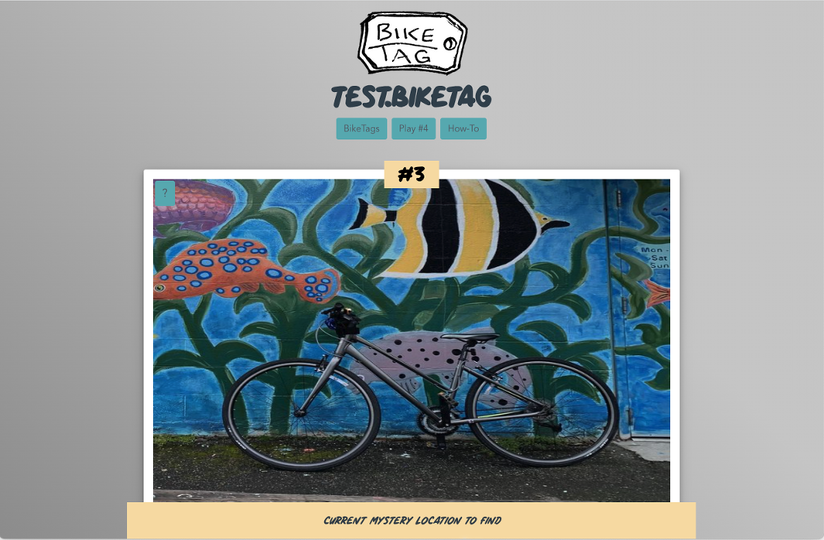
BikeTag is a mystery photo tag game played on bicycles. The game is like a scavenger hunt or geocaching. Players go to their game at bikeag.io, see where the the current Mystery Location is and then go find the location. Once they arrive, they take a picture of their bike at the current Mystery Location, upload their image and continue on to a new Mystery Location. Once there, the player uploads both the found image and new mystery image to complete a round of BikeTag. At that a new round has started and it continues from there.
BikeTag players have used many platforms to play the game including web apps, Reddit, Twitter, Imgur and Facebook groups. Each region also has small rule variations based on user needs.
The developers at biketag.io want to create at an app for players to use that web app, players can submit their BikeTag Posts to the game in their city/region to play the game of BikeTag.
Key tasks identified by the developers were allowing users to see the current mystery location, see their competition for the round, see past bike tags, leaderboards and profiles. They also expressed an interest in adding future features including social login, editable player profiles, and an admin panel to allow admins ability to manage the game play.
The Objective
Evaluate usability and accessibility of current site, identify areas of opportunity for improvement and prototype potential solutions.
The Process
An initial cognitive walkthrough of the app was conducted to familiarize and evaluate. User research interviews were conducted with current BikeTag players who used different platforms to play. A prototyping plan was developed and then designed. Finally, the findings and interactive prototype were presented to BikeTag stakeholders.
Evaluation: Cognitive Walkthrough & Task Analysis
Using this method of evaluation allows User Experience researchers to evaluate interaction flows and identify where they succeed and fail based on the criteria including evaluating the interaction model, visibility of calls to action, mapping and feedback.
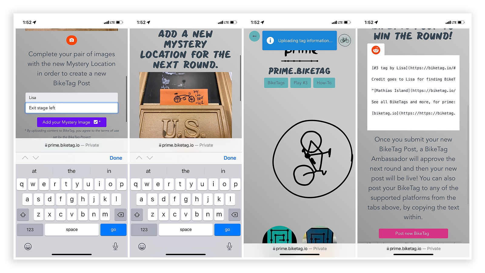
Using this approach it was determined that the game play steps were confusing to users. A potential 2-3 step process was extended in the initial design to 5 screens and an 3 submission steps rather than 2. The design not matching users’ mental models made interacting with the current design confusing and frustrating.
Additionally, evaluating as a new user, the lack of way finding information and explanations made it difficult to at first identify the purpose of the app, what BikeTag was and how to engage with the app.
User Stories
- As a cyclist I want to check out biketag.io to learn how to play biketag so I can play with with my friends.
- As a cyclist wanting to join this group of biketag, I want to create a profile and share social media handles so I can make connections with layers in my community.
- As an admin of this local game of biketag, I want to be able to control certain functions of the app depending on which rules we choose to enforce so I have flexibility to make the app align with our existing rules. (Options to toggle banked locations, multiple hints, comment sections and feedback options for biketags posts/pics.)
- As an admin I want to be able to edit user biketag posts if they violate the rules of our game so I can ensure fair play.
- As a regular bike tag player I want to be able to see context clues on the biketag posts like timestamps and hints so I can use them to find the location and know how quickly the game is moving.
- As a biketag player, I want to be able to have a clear flow to uploading location one and two images with a clear submission process so I know I've been successful at this round of the game.
- As a player who wants to be social with other players, I want to be able to add comments to to comment on someones bike or cool location or ask questions so I can make new social connections and build my community of biker friends.
Primary User Research Protocol
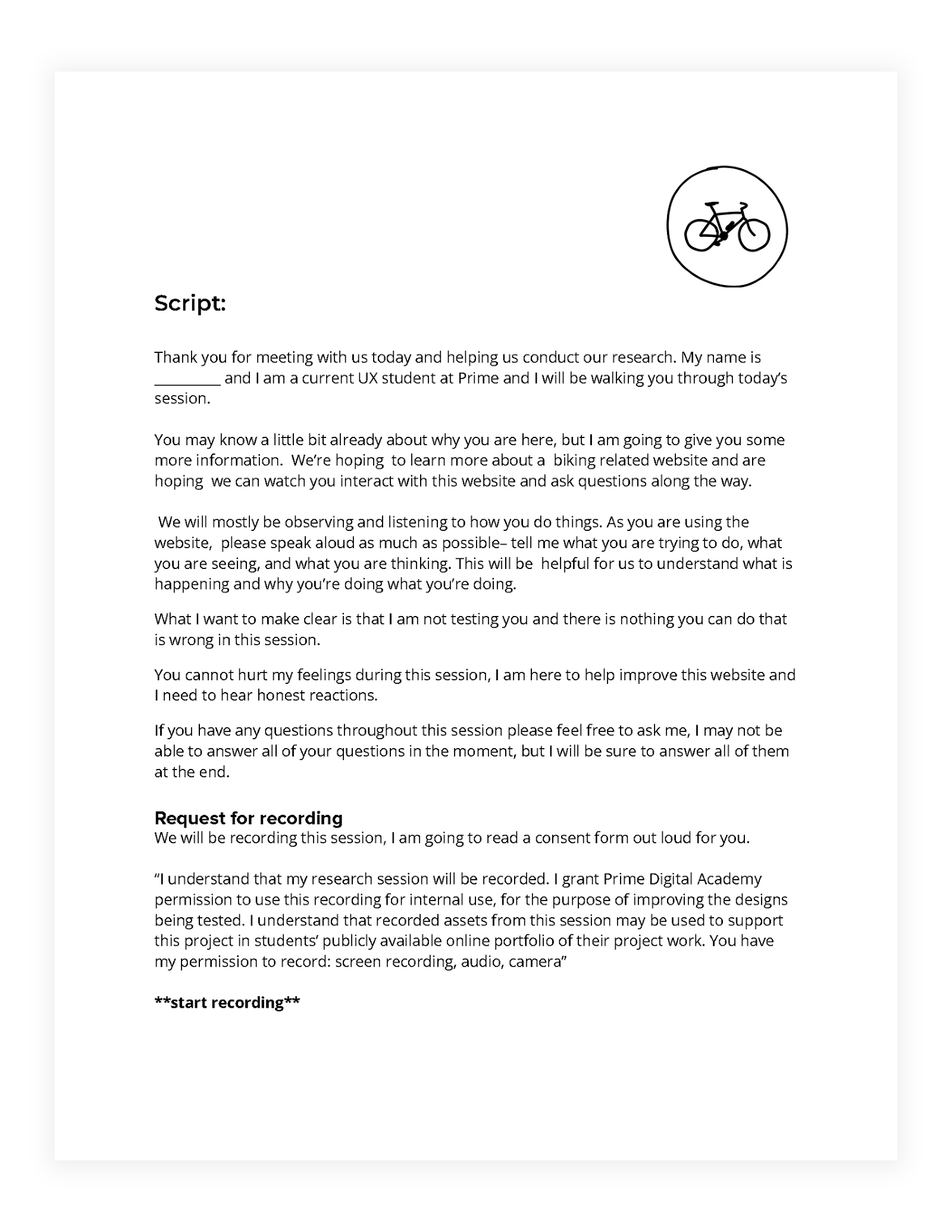
Research was conducted during two virtual interviews via Zoom with current bikeTag players. One was from Washington and the other from Minnesota.
Research Goals
- First impressions
- What tasks are important to the user
- Identify pain points
- What excites the user to use the app
User Interviews
Research was conducted during two virtual interviews via Zoom with current bikeTag players. One was from Washington and the other from Minnesota.
The research team gain insights on the ins and outs of game play, user motivations and interests, communication and privacy preferences and their impressions on the existing BikeTag app.
Research Findings & Prototype Planning
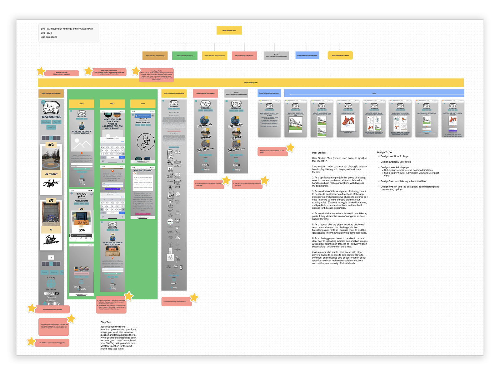
Taking the insights gleaned from the research, a prototype plan was created. The prototype plans took into account the user needs, identified pain points of the current design as well as the developer’s future goals.
Pain points included confusion between photo submission screens, page navigation and user orientation and navigation on the app.
Design Goals
- New user setup/login
- New biketag submission flow
- Add timestamp and commenting options to BikeTag post page
- Simplify How To Page
Prototyping
Using Figma a new user flow and design were created with some assets provided by the developer and some created for the prototype.
Conclusion
Users are excited to use the BikeTag app and while the game is simple, the interface did not make it as user friendly as it could have. By removing two steps on confirmation, allowing users to login and create profiles and connect with others with comments on the BikeTag posts, the app will add a new level of engagement, excitement and ease of use.
Next Steps
Moving forward I would recommend the following actions:
- Build out a slide out navigation bar from hamburger menu
- Create an admin panel to allow for modification of local rules, edits of post and newsletter settings.
- Integrate option to login through 3rd part accounts, as well as allowing email only logins with options to post social media handles and simple profile tag lines, profile photo, etc.


