Case Study: Prentus
Conducted by:
Lisa Zampogna
Tools
Figma, Figjam, Zoom, Google Suite
Skills / Services
Stakeholder interview, Secondary Research, Competitive Benchmarking, Data collection & synthesis, Low fidelity sketching, High fidelity prototype, Usability testing, Stakeholder presentation, and Findings and Recommendations Report
Location:
Twin Cities
Deliverables
Directed Storytelling, Multi-touchpoint Strategy Map, Competitive benchmarking, Cognitive Walkthrough, Findings, and Recommendations Report
Purpose:
Evaluate and extend the employer-facing experience on a platform built to connect recent bootcamp graduates with employers and recruiters.
Roles
Designer, Researcher, Interview Moderator, Presenter
Overview
The Client
Prentus.co is an all-in-one platform for schools to run their career services, alumni communities, and employer partnerships. The platform is meant to connect recent bootcamp graduates (with a variety of professional backgrounds) to hiring employers.
The Problem
Discovery research revealed candidates were interested in quickly accessing candidate portfolios, contact information, and information that allowed them to see what set candidates apart from one another.
Prentus.co tasked my team with figuring out how we might help them onboard, engage and retain employers on their platform.
The Solution
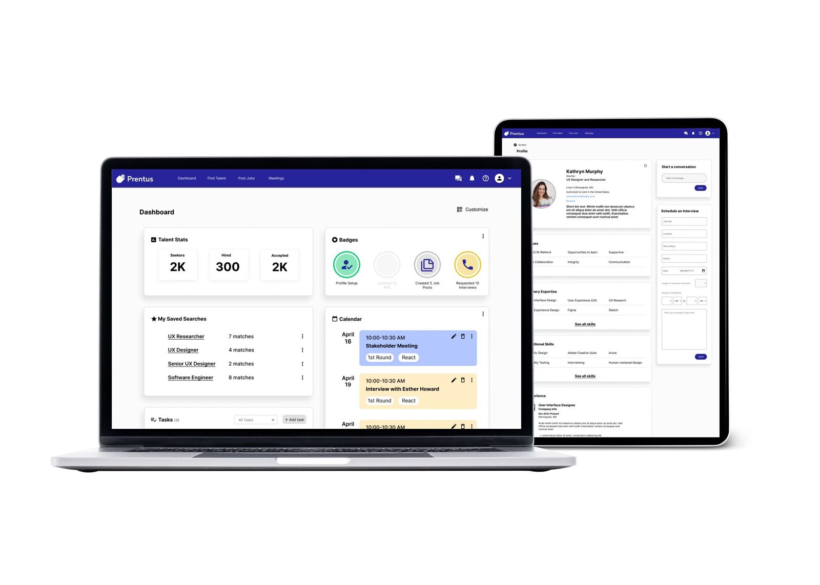
Taking into consideration the insights acquired during our discovery stage, we created a high-fidelity interactive prototype.
Keeping the needs of the hiring manager user group in mind we built features that would serve their needs better which would ultimately serve the mission of the platform, which is to help BootCamp graduates get matched with hiring managers. We did this by creating making design choices based on the insights gleaned from our discovery research.

The Process
The Objective
Our goal was to help Prentus build tools to help optimize and extend the employee-facing experience on the platform.
We knew from a project brief provided by Prentus that employers currently had the ability to register, sync their Google calendars, Applicant Tracking Systems, and send interview requests to job seekers. Unfortunately, most employers did not use the platform to schedule interviews.
Our focus then became to research and design an employer experience that included onboarding, simplifying their experience on the platform and finding and communicating with job seekers.
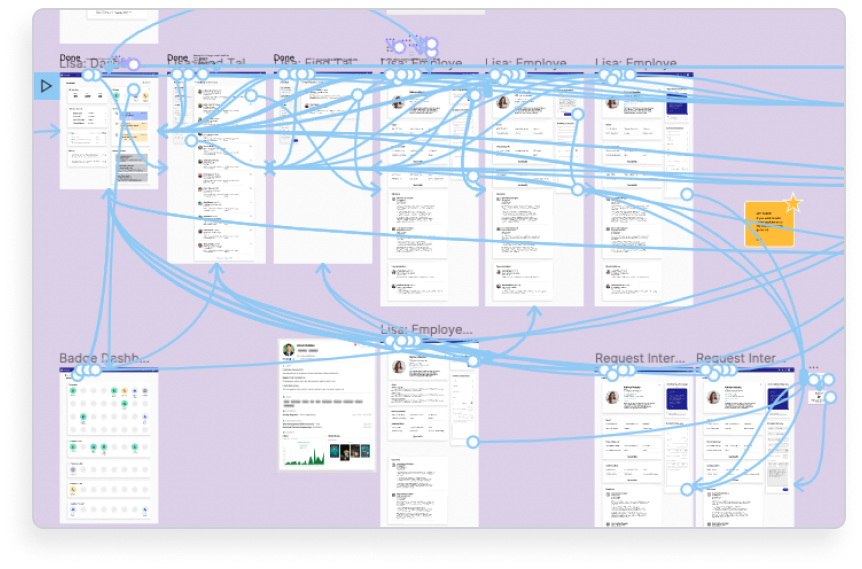
We created a multi-touchpoint strategy map to address the recruitment and retention of employers on the website. Identified digital features and communication during the onboarding, applicant discovery, interview, and hiring processes and designed high-fidelity prototypes of the employer experience.
To reach this goal, I worked with three teammates to:
- Conduct stakeholder interviews to better understand the organization's goals.
- Complete competitive benchmarking to better understand the space.
- Secondary research on gamification and best practices for user onboarding, retention, and messaging.
- Hold user interviews during the discovery phase of our project to learn priorities and pain points experienced by hiring employers and recruiters.
- Created an interactive high-fidelity prototype to run usability tests on our proposed feature concepts.
- Produced a findings and recommendations report.
- Delivered the project process and outcomes through a presentation and client package.
Stakeholder Interview
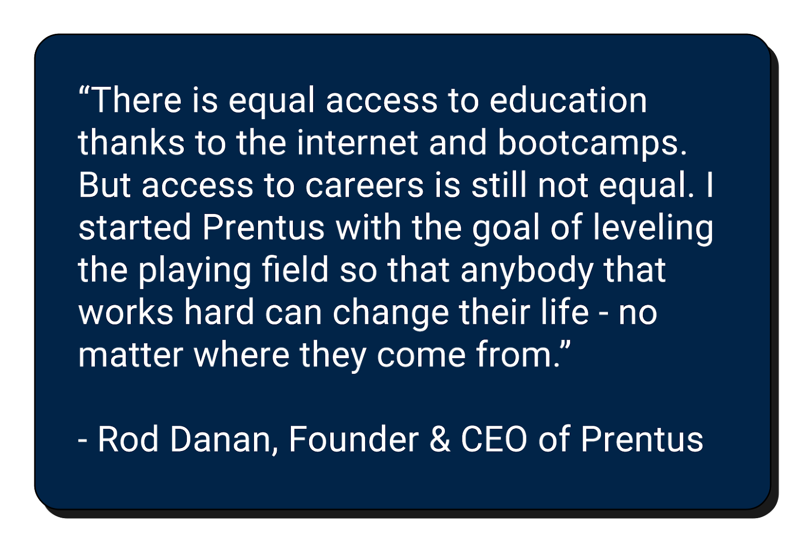
To begin the process my team and I met with Rod Danan, the founder, and CEO of Prentus.co via Zoom to gain insights into his vision and context regarding the platform.
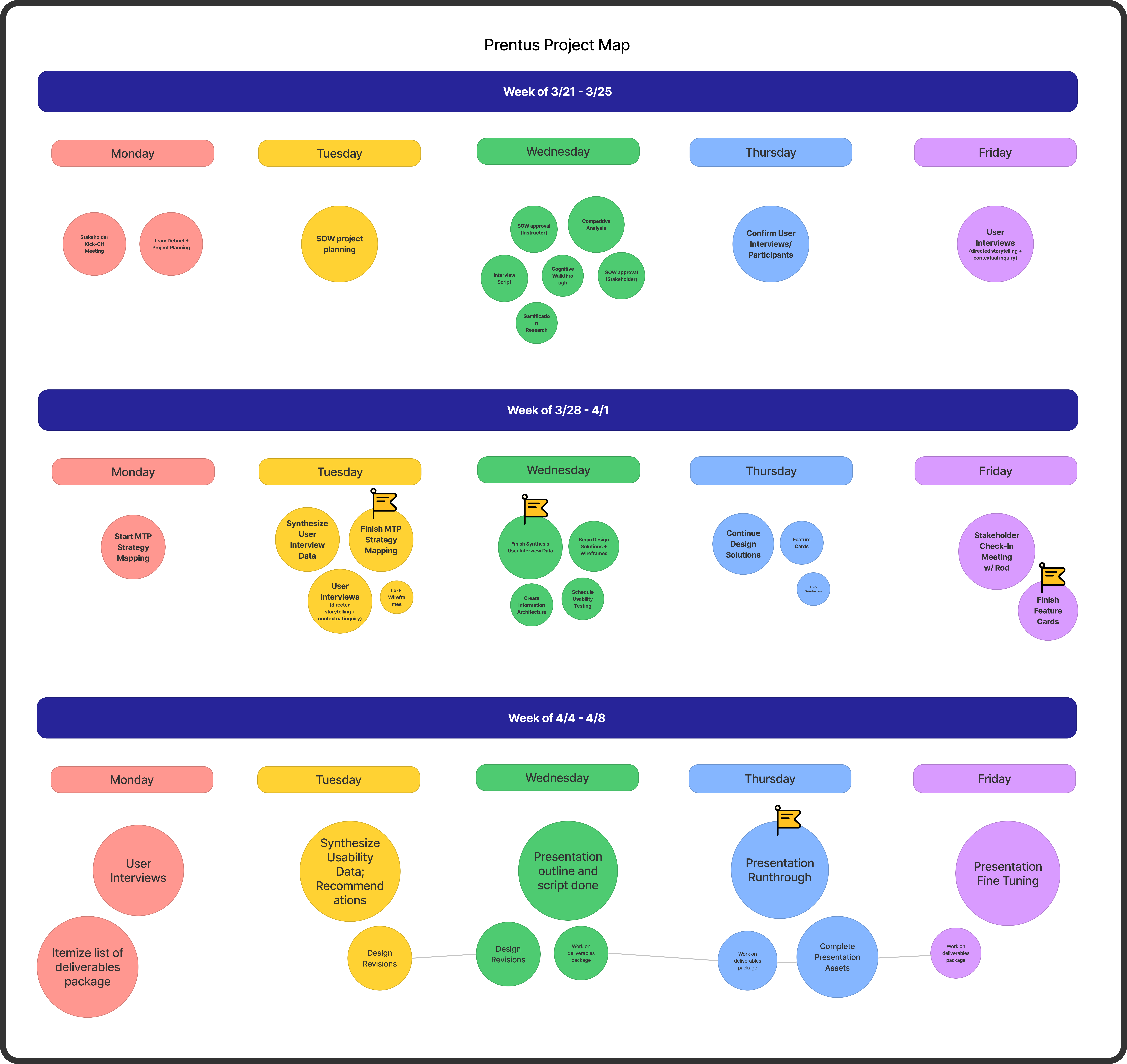
Following the interview, we created a scope of work defining our project's objectives and had Rod sign off on our plans, and began developing a process map to plan our project timeframe.
User Groups
- Bootcamp students and recent graduates
- Bootcamp career professionals
- Employers and recruiters
Preliminary Planning
Before beginning the discovery stage of our project, we decided we would plan to approach the challenge by creating a multi-touchpoint strategy map and prototype to test our design concepts and find out if our ideas help meet the users' needs and help Prentus improve overall engagement with the employer user group.
Our planning also included creating a process map to come up with a project timeline and scope. The scope of work included our user groups and problem and suggested solution overviews as well as a list of our planned deliverables.
Competitive Audit
I assisted Alex in conducting competitive benchmarking on similar platforms used by bootcamp schools to assist their students in their job searches.
Key features included some of the following:
- Goal of connecting new tech talent with tech roles
- Branding
- Engagement
- Search features
- Interview and communication
- Hiring
Contextual Inquiry
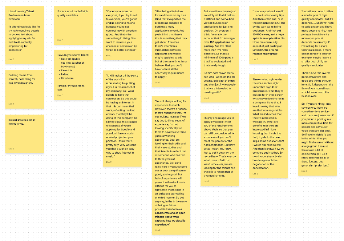
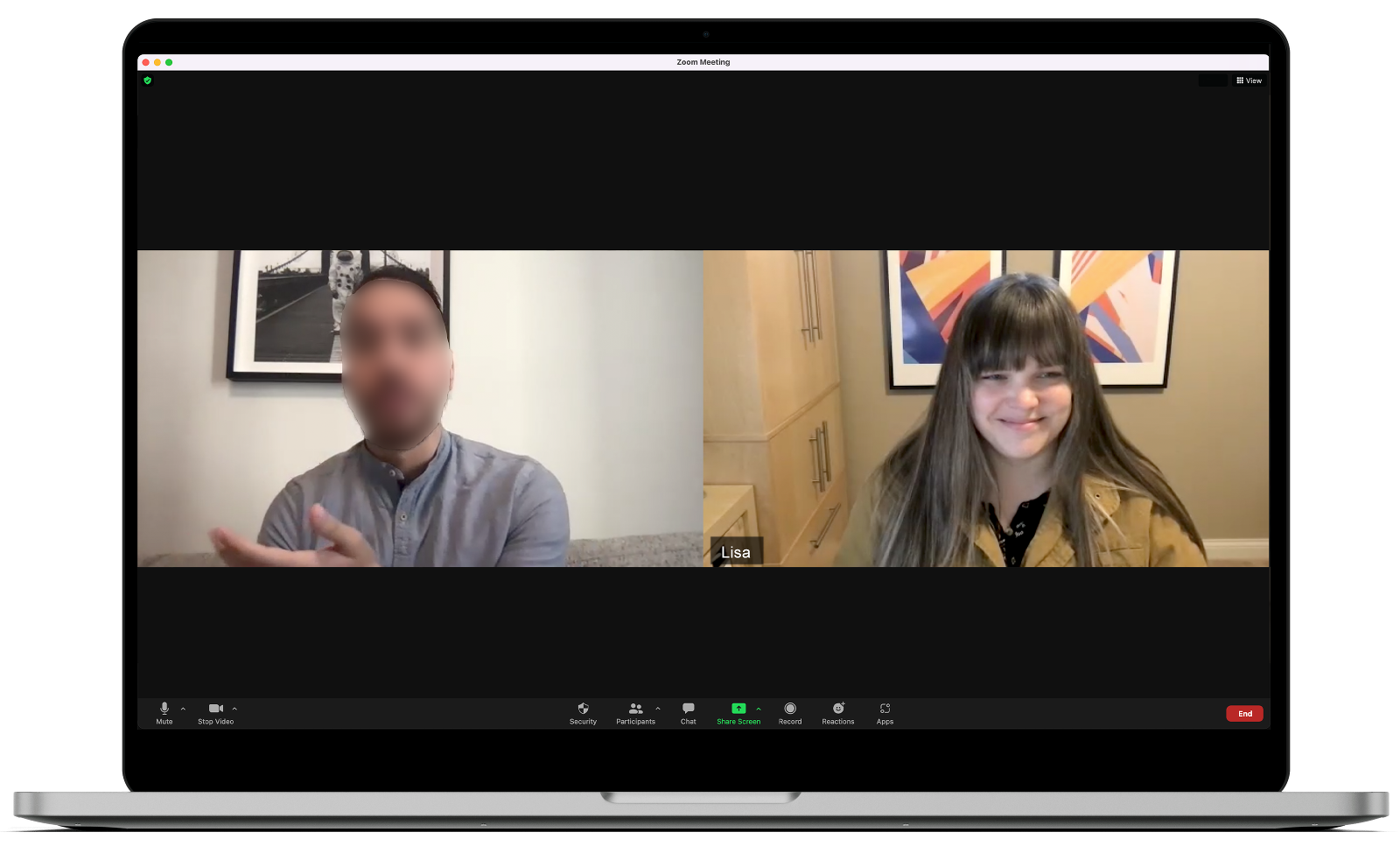
Using contextual inquiry our team took turns interviewing hiring managers to gain insights into their values, goals, and priorities when using similar hiring platforms. The three participants all had were all previous or current experience hiring tech bootcamp grads as recruiters or hiring managers. My team members created a findings report that discussed the insights gathered from the interviews. A full copy of the research report created by Stephanie can be reviewed here .
Tools used: Otter.ai, Figjam, Zoom
Notes taken in group's Figjam file.
Secondary Research
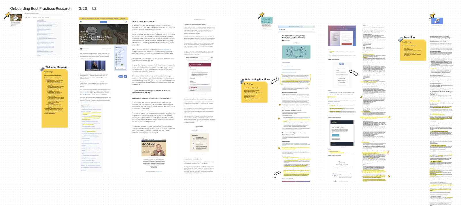
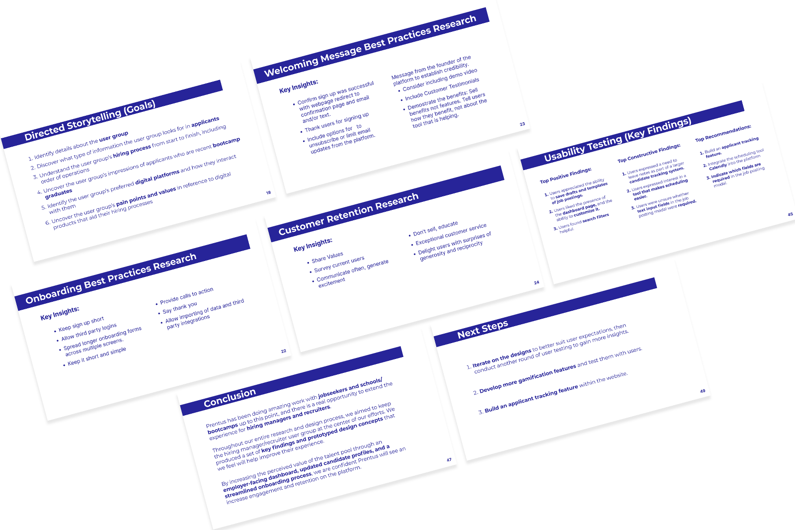
With Rod's goal of attracting, onboarding, and retaining employers to his platform I decided to search for resources that could inform us on best practices for effective onboarding flows and techniques.
While the information I gathered was interesting, in the future I will be more careful to choose sources that are based on more rigorous research and peer-reviewed.
While I think the information I found was insightful and helpful, we ultimately took the project in a direction that did not really pursue or use this portion of our inquiry. But for the sake of reporting what I found, I will include the information below. The source of the information I gathered were from two companies that help their clients scale their businesses through better customer communication and marketing.
Notes taken in group's Figjam file.
Key Takeaways of Welcome Messaging:
- After a user signs up, confirm sign up was successful
- Webpage redirect to a confirmation page
- Email or text to confirm the signup
- Include an offer to unsubscribe from certain email communications where applicable.
- Include marketing email to assist with white labeling in the email system.
- Include an attention-grabbing Welcome message
- Thank users for signing up
- User flexibility: Talent profile, an option to select the preferred communication channel, links to social networks.
- Consider a message from the founder of the platform to establish credibility.
Consider including a Mock-up infographic showing the onboarding step-by-step and setting expectations - Consider including a demo video
- Customer Testimonials: more credibility
- Demonstrate the benefits: Sell benefits not features. Tell them how they benefit, not about the tool that is helping.
- Include calls to action.
Key Takeaways of Onboarding Practices:
- Keep sign up as short as possible
- Allow third-party logins
- Spread longer onboarding forms across multiple screens.
- Keep it short and simple
- Provide calls to action
- Say thank you
- Allow importing of data and third-party integrations
Key Takeaways for Customer Retention Strategies:
- Share values
- Survey current users
- Communicate often, generate excitement
- Don’t sell, educate
- Exceptional customer service
- Delight users with surprises of generosity and reciprocity
Touchpoint Strategy Map
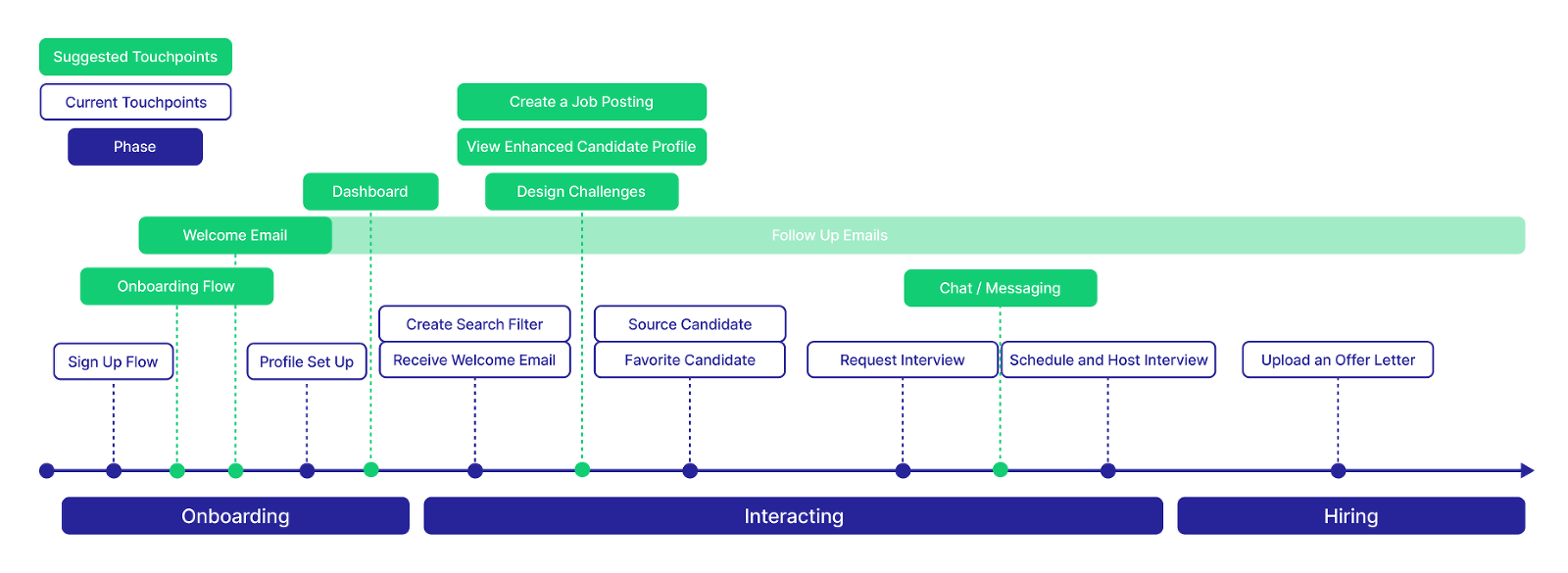
By using the insights gained in our discovery research, user goal statement and business goals we created a multi-touchpoint to illustrate the needs of the users and help guide us through our generative process.
Three phases of the touchpoint map included onboarding, interacting, and hiring.
Current touchpoints included: sign-up and onboarding flow, source and flag candidates, request interviews, schedule interviews, and upload an offer.
Through our process we determined to add the following features to be wireframes and built into an interactive prototype: onboarding flow, welcome/follow-up email series, employer dashboard, create a job posting, candidate profile view, gamification element through badges.
Additional Research
Other research included a cognitive walkthrough on the existing platform to gain insights on areas of friction and context setting, secondary research on gamification, and synthesis of all of our findings following the user interviews.
At this point we determined the users we interviewed we interested in hiring tech bootcamp graduates, they wanted quick access to candidate experience, specific skills, soft skills, and most importantly quick and easy access to the candidate's portfolio link.
Prototyping
Low-fidelity sketches
Ia and I worked together in the beginning stages to discuss best practices, design systems, information architecture, and heuristics, and generally get on the same page about the overall design.
Each member of the team took one of the suggested touchpoints from the strategy map to create low fidelity wireframes for features including badges, job posting flow, an employer dashboard, and a re-design of the current candidate profile.
I focused on the employer dashboard and re-design of the current candidate profile.
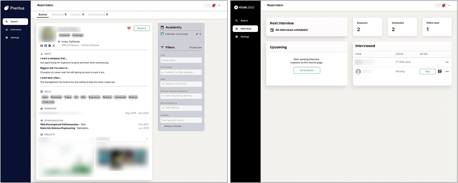
Currently the landing page for the employer a candidate in an unfiltered search. The image on the right is a current design for an Interview screen. We used some of these designs as starting points for our design work.
High-fidelity Prototype
While Alex built the job posting flow, Ia took on the badges feature and I designed the candidate profile, and the employer dashboard built an interactive search function and connected all of the various elements into a working prototype.
Usability Testing
Usability Testing Methodology
- 2 participants were interviewed using a prewritten script, which contained think-aloud usability testing and comparative testing protocols
- The interviews lasted approximately 30 minutes
- The interviews were moderated and took place remotely via Zoom
Usability Testing Goals
- Evaluate the degree to which the product meets the user group’s needs, particularly in reference to:
- Candidate profiles
- Gamification features
- Job posting user flow and content
- Candidate search capabilities
- Communication with candidates
- Identify whether the product feels intuitive to navigate and understand, and pinpoint areas for improvement
- Discover the user group’s first impressions of the product
Key Findings
- Users appreciated the ability to save drafts and templates of job postings.
- Users liked the presence of the dashboard page, and the ability to customize it.
- Users found search filters helpful.
- Users said the notes feature included on the dashboard view would be more helpful on the candidate profile pages and the desire for a robust candidate tracking system.
- Users expressed interest in a tool that makes scheduling interviews easier.
- Users were unsure whether text input fields in the job posting modal were required.
Recommendations
- Build an applicant tracking feature.
- Create a tool with similar functions as Calendly into the platform
- Indicate which fields are required in the job posting modal.
Presentation
Finally, we took our findings and presented the project to a live online audience, as well as a group of peers and stakeholders in person.
Next Steps
- Using user feedback and heuristic analysis, evaluate the current prototype and rework it taking into consideration the recommendations above.
- Create extension features identified by users that would add more value and interest for our user group including candidate tracking and team communication functions as well as interview scheduling.
- Dive into other onboarding aspects of the user journey to make sure Prentus is connecting with its users in an effective way to get them coming back to the site and engaging with the new bootcamp graduates.
Prentus has been doing a great job acquiring bootcamp students to their platform and by addressing some key opportunity areas for the employer user group I believe it could help Prentus achieve its goals. We created a set of key findings and prototyped design concepts with our user group ever in the forefront of our minds. I was happy to have played my part in this project by designing the employer-facing dashboard to help users access and organize key tasks, updated candidate profiles to add additional data points for our users to consider and streamlined the onboarding process.
If we had more time I would have liked to explore and strategize more around the area of the user journey from the initial sign-up, email touchpoints, and communications from Prentus to make sure users were reminded and excited to come back to the platform.
Thank you
A special thanks to Rod Danan for allowing us to help make his amazing platform more effective for its users. I really appreciated his time and interest in including us in his project. As a recent graduate from a tech bootcamp I am happy to know there are people and companies like Prentus who are making it their goal to help people like me be successful in pivoting careers after an intense and rewarding educational experience.
