Case Study: Exhibits Development Group Usability Study
Conducted by:
Lisa Zampogna
Tools
Figjam, Zoom, Google Suite, Pages, Numbers, Keynote, Photoshop
Skills / Services
User Observations, Heuristic Analysis, Design Concepts, Evaluation plan and research, Product Presentation
ROLES
Research, Evaluation, Interviews
LOCATION:
Twin Cities
Deliverables
Usability Test Planning, Usability Review, Usability Test Script, Usability Test, Findings & Recommendations Report
Purpose:
Evaluate Exhibits Development Group's (EDG) existing website and discover any user experience challenges and opportunities to improve design to help EDG achieve its goals.
Summary
Project overview and what I learned
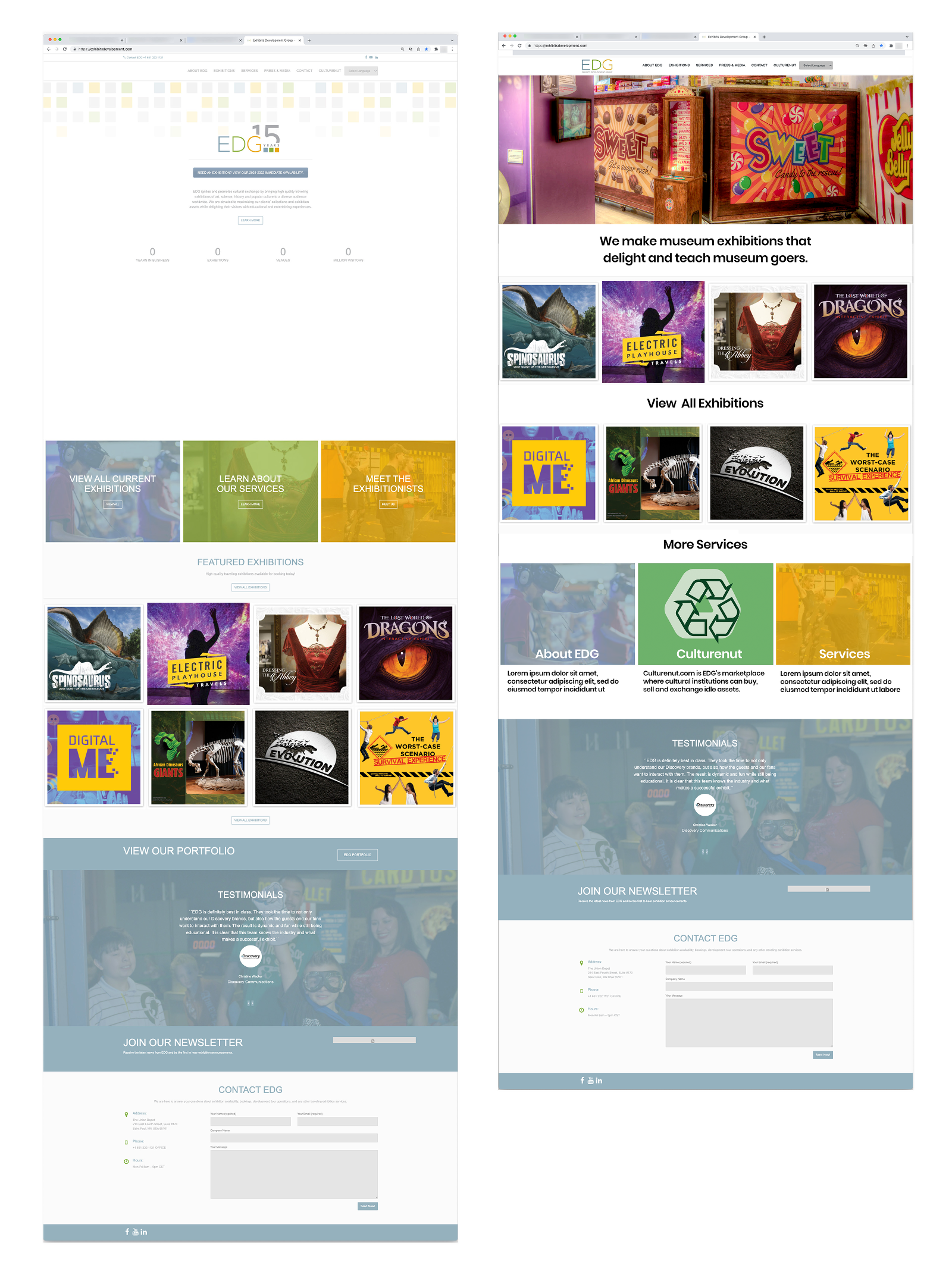
Our process in understanding the goals and scope of our project began by evaluating Exhibits Development Group's current site (exhibitsdevelopment.com) using Nielsen's 10 Usability Heuristics and identified potential improvement opportunities. We conducted usability tests and gained insights that synthesized using an affinity diagram. We found that EDG is in a fantastic position to make a few key changes that will improve major pain points for its users. EDG's exhibitions and corresponding collateral and materials excited users. Leveraging those strengths by featuring them more prominently on the website's landing page and clearly communicating its mission will go a long way in accomplishing EDG's main objectives. Much of the confusion for users resulted from 1) the purpose of EDG's landing page being unclear, links that take users away from the EDG site into Dropbox folders, and links whose behavior was outside the users' mental model.
Next Steps
If I had more time to spend on this project I would suggest creating the option to filter exhibits based on keywords, interactivity, and subject matter. I would adding search capabilities on the website and clear calls to action within the pages of the website. Additionally, I would suggest an interactive calendar that showed selected exhibitions' availability and where it is is already booked. Many of these features would alleviate some of the basic confusion and frustration experienced by users of EDG's website.
The Objective
EDG wants a website that effectively and efficiently promotes their products and generates leads.
Exhibits Development Group (EDG) is a local, female-led organization, that is an industry leader in the development, marketing, and distribution of high-quality traveling exhibitions. They produce exhibitions with topics including arts, science, history, and popular culture for museums and cultural institutions.
EDG's goal for its website is to effectively promote their exhibitions, allow easy accessibility for to details of their exhibits to potential buyers/renters, and seamlessly connect clients with proper staff to streamline intake, scope and respond effectively.
EDG also wants their website to educate its visitors to their professional services which include: sales-marketing, logistics, installation/de-installation, and management of their projects.
Usability Review
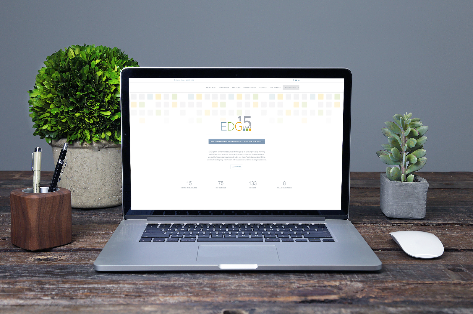
Conducted initial review of the EDG website to identify possible usability issues and improvement opportunities.
EDG's identified five primary tasks:
- View all available exhibitions to potentially display at an institution/organization
- Find a specific exhibition to display at their institution/organization
- Identify the important details about an exhibition
- Contact the organization about bringing an exhibit into their organization
- Understand the other options for engaging with EDG
Heuristic Analysis
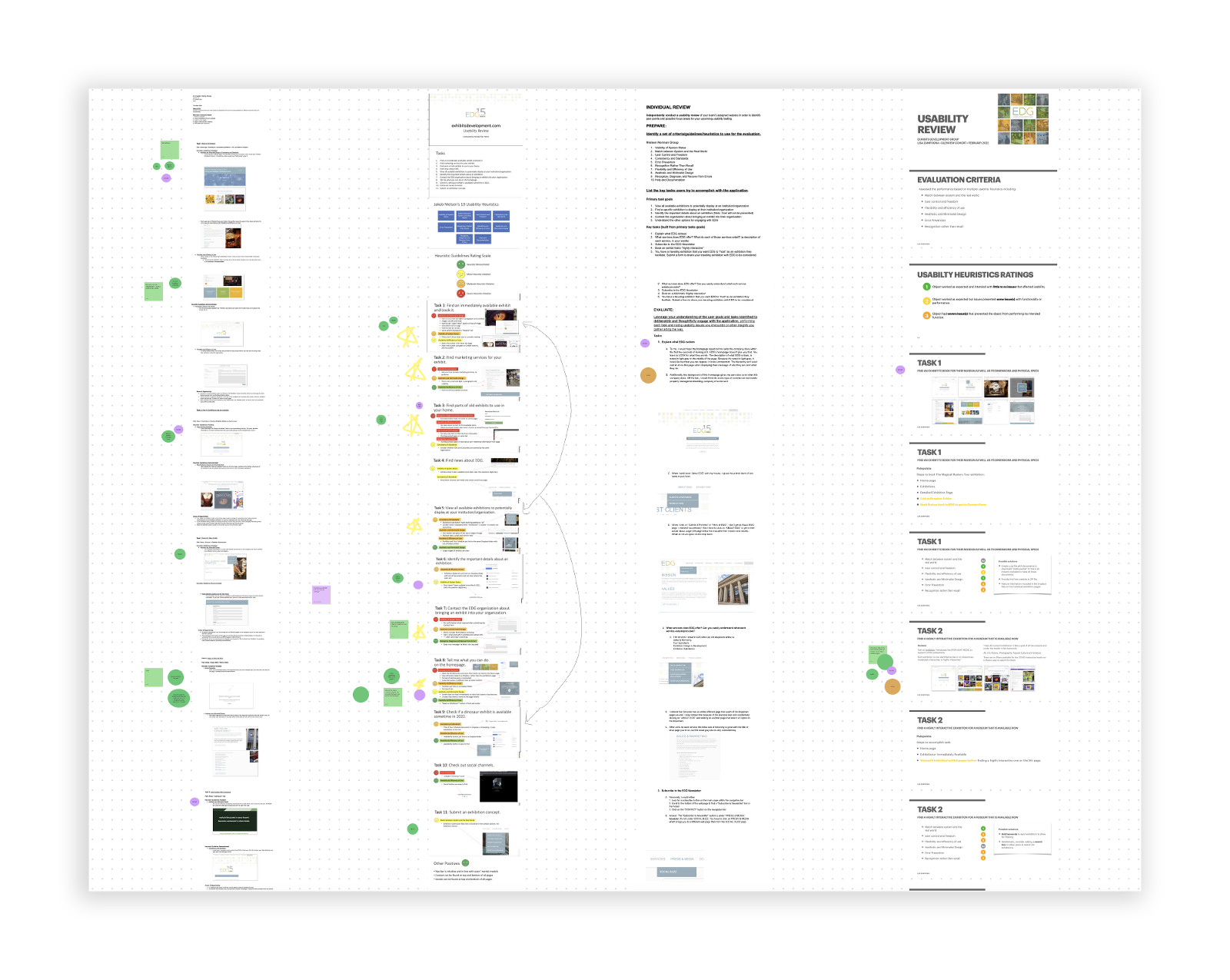
Using the Jakob Nielsen’s 10 Usability Heuristics for User Interface Design several key opportunities presented themselves.
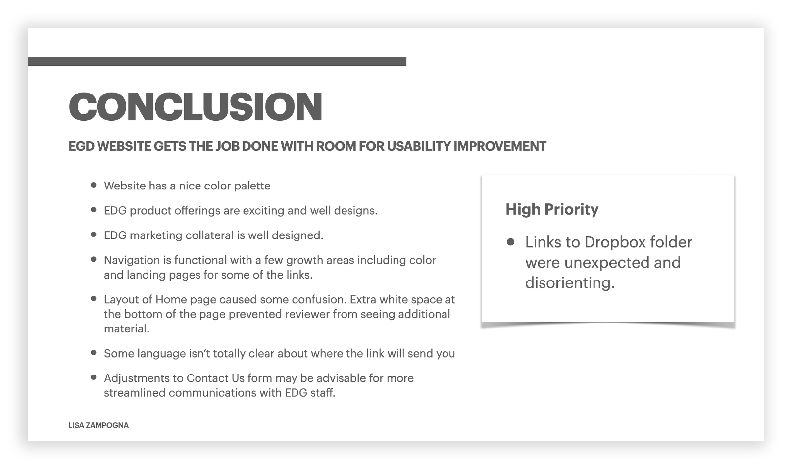
- Website has a nice color palette
- EDG product offerings are exciting and well designs.
- EDG marketing collateral is well designed.
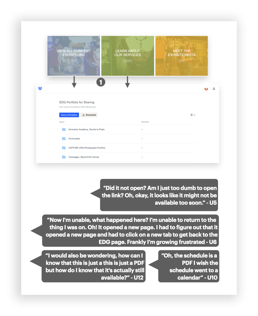
- Links to Dropbox folder were unexpected and disorienting.
- Navigation is functional with a few growth areas including color and landing pages for some of the links.
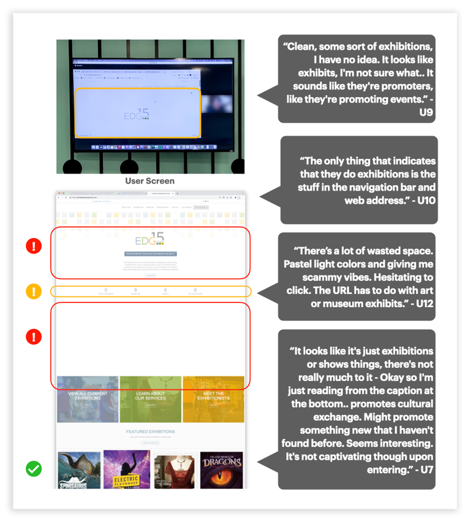
- Layout of Home page caused some confusion. Extra white space at the bottom of the page prevented reviewer from seeing additional material.
- Some language isn’t totally clear about where the link will send you
- Adjustments to Contact Us form may be advisable for more streamlined communications with EDG staff.
Synthesizing Review Findings
Design team collaborated to develop a series of tasks to for users to perform so usability, understanding and accessibility could be evaluated.
RESEARCH GOALS
- How do users go about finding information?
- What roadblocks do users encounter while booking exhibits or services?
- What information do users need in order to make a decision?
- What do users think about or get from the Dropbox files?
- What do users think CultureNut is?
User Testing
Methodology
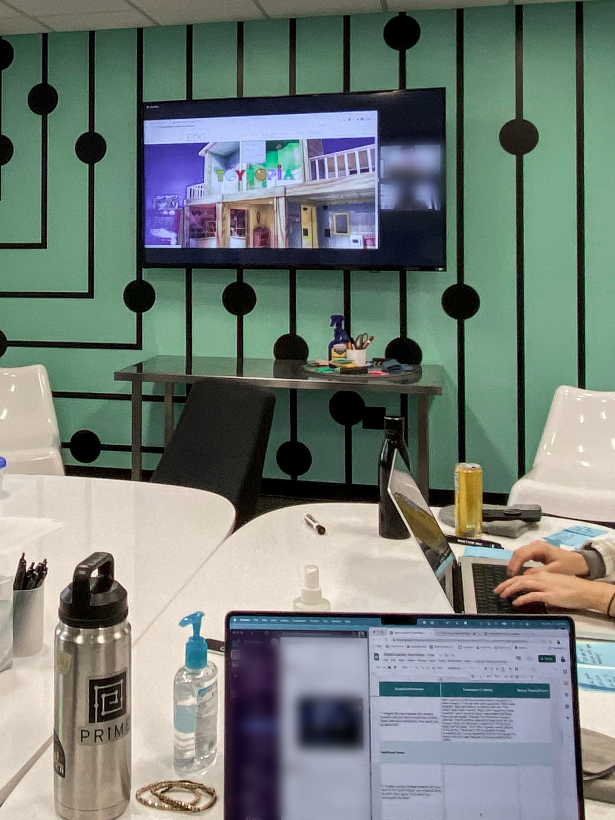
The design team interviewed a total of 12 users to collect user experience data. Each team member moderated 3 of the user testing sessions which were 30-minute video via Zoom using Concurrent Think-Aloud Protocol.
Design team developed the following scenarios to evaluate usability in key areas.
- Imagine you are a curator at a science museum and you want to book one of EDGs highly interactive exhibitions. How would you go about this?
- Imagine you’re a vintage collector and you want to buy some unique, one-of-a-kind items to add to your space. How would you accomplish this task?
- You are a museum curator and an exhibit dropped out last minute. You need to stage something as soon as possible. Find an exhibition that’s available in April 2022.
- You’re a visual artist and you’ve spent the last year creating an amazing exhibition. How would you go about pitching your idea?
- You are the marketing director at a museum, and your team is short staffed. The team needs to advertise the newest dinosaur exhibit that they sourced from EDG. How would you seek out marketing assistance from EDG?
- You’re on the job hunt. Apply to work at EDG.
Synthesizing: Affinity Diagramming
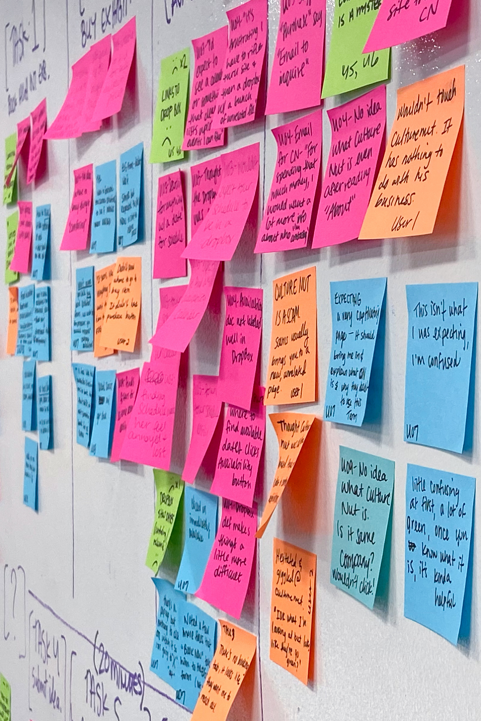
Data was recorded and categorized to identify themes using affinity diagramming.
Themes emerged from user experience data
- EDG's mission is unclear
- Some design need attention (typography/color/contrast)
- Usability has room for improvement
- Contact forms is not specific enough
- Some linking functions are confusion, superfluous
- Key services lack findability
- Apply to Work tab has issues
- CultureNut is confusing
- Dropbox is confusing
Findings & Recommendations
After evaluating, testing, synthesizing and analyzing it is now time to deliver Key Findings and Recommendations to our client, EDG.
Key data points
- 7 out of 12 users would recommend site to friends the industry.
- 4 out of 12 users found the site easy to understand.
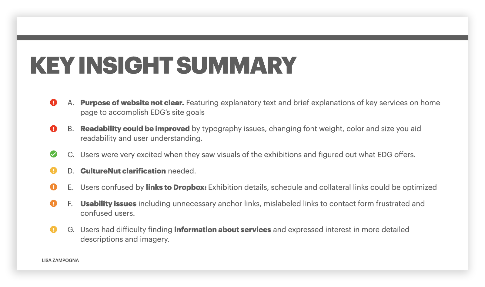
Key Insight Summary
- Purpose of website not clear. Featuring explanatory text and brief explanations of key services on home page to accomplish EDG’s site goals
- Readability could be improved by typography issues, changing font weight, color and size you aid readability and user understanding.
- Users excited by EDG Exhibitions
- CultureNut clarification needed.
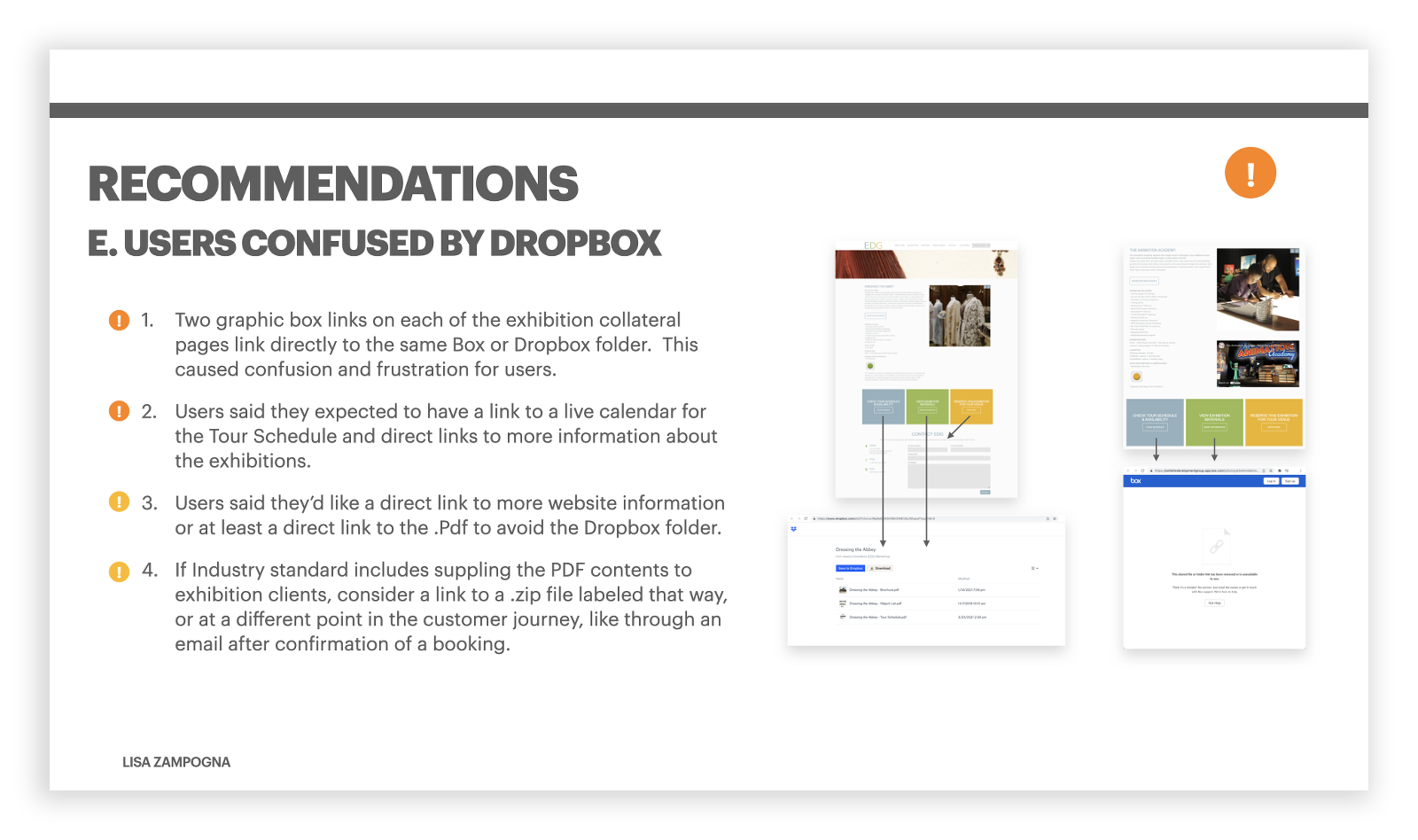
- Users confused by links to Dropbox: Exhibition details, schedule and collateral links could be optimized
- Usability issues including unnecessary anchor links, mislabeled links to contact form frustrated and confused users.
- Users had difficulty finding information about services and expressed interest in more detailed descriptions and imagery.
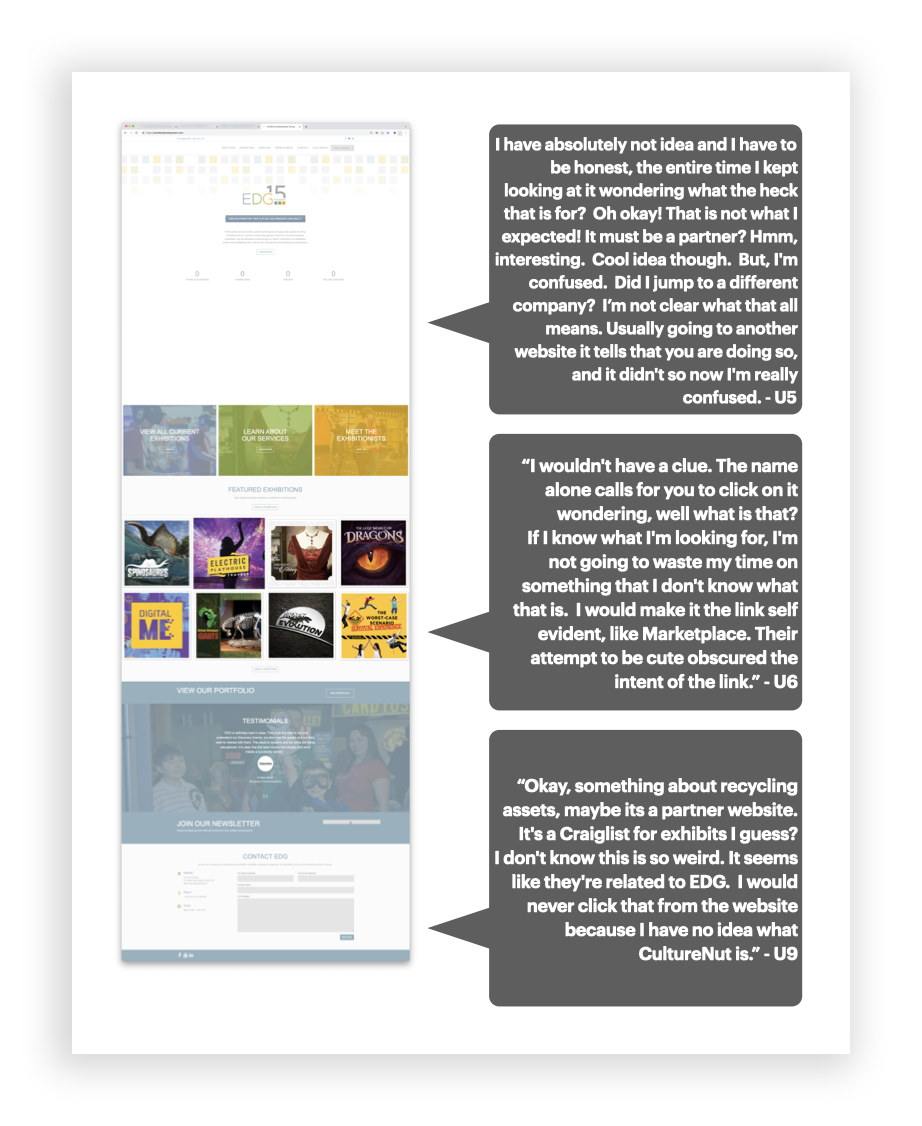
User Feedback About CultureNut
Contained in EDG's organization goals it mentioned "the CultureNut platform—a game-changing tool for the museum and cultural clients it serves."
Unfortunately, it's placement in the navigation bar with no other visual or textual explanations made it impossible for EDG site users to identify what it was.
User Feedback about Dropbox
While users were very excited about EDG's product offerings, the way EDG currently presents it exhibition materials, details and schedules left users confused and frustrated.
EDG Website Index Before and After
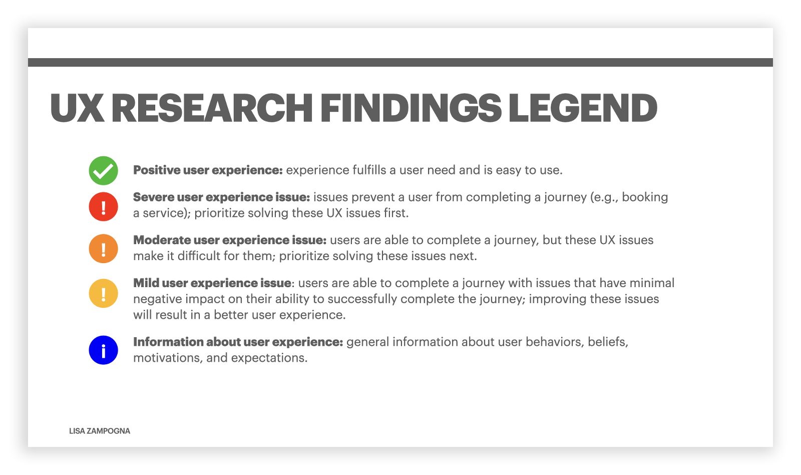
Key Slides from Findings and Recommendations Report
Conclusion
EDG is in a fantastic position to make a few key changes that will improve major painpoints for its users.
EDG's exhibitions and corresponding collateral and materials excited users. Leveraging those strengths by featuring them more extensively on the website, while clearly presenting the mission of EDG through text will go a long way in accomplishing EDG's main objectives.
The other findings and recommendations focused on key pain points in the user journey that could be improved to help accomplish tasks set out by EDG and the design team.
Thank You
EDG's exhibitions and corresponding collateral and materials excited users. Leveraging those strengths by featuring them more extensively on the website, while clearly presenting the mission of EDG through text will go a long way in accomplishing EDG's main objectives.
The other findings and recommendations focused on key pain points in the user journey that could be improved to help accomplish tasks set out by EDG and the design team.
