Case Study: Fresh Food
Conducted by:
Lisa Zampogna
ROLES
Research, Evaluation, Interviews, Design
LOCATION:
Twin Cities
Tools
Sketch, Axure, Zoom
Skills / Services
Research Design, User Interviews, Wireframing, Prototyping, Usability Testing, Evaluation and Findings
Deliverables
Hierarchical diagram, journey map, low-fidelity wireframes, high-fidelity prototypes.
Purpose:
UX research and design of new online grocery store app
The Objective
Conducted user interviews with directed storytelling on Zoom to pinpoint pain points in existing online grocery store app offerings and used the findings to develop solutions to address the users' existing needs. Process included creating wireframes, a user flow map, hierarchical diagram and finally an interactive prototype for a new website. Leveraged existing successful designs to add supplementary features to include added ability for users to communicate specificity and qualitative information to the shopping service providers as well as addressing concerns around packaging preferences and waste. Usability testing yielded more user insights around user feedback on specific forms and need for additional way-finding elements in the checkout process.
User Goals
My user group is women in their 40s with 2+ children who are interested in safety during a pandemic who came to enjoy the convenience of online grocery shopping who want reliable, fast, affordable, predictable grocery services that offer good communication and ability for user feedback and specificity of item requirements while not adversely impacting the environment.
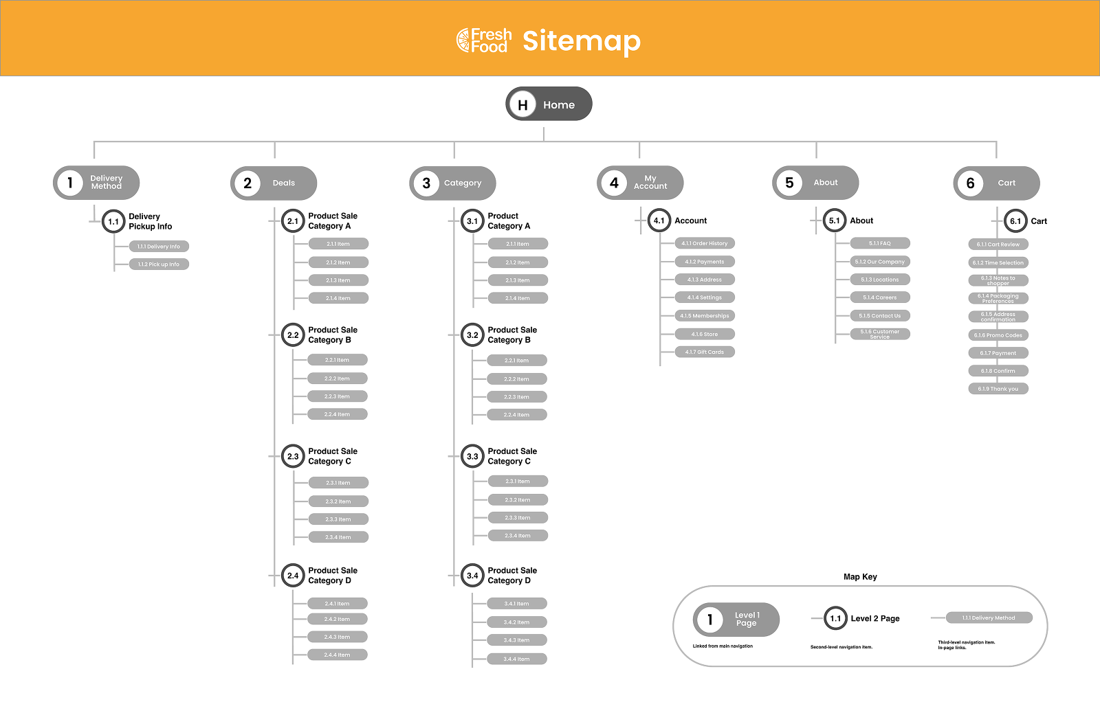
Hierarchical Diagram

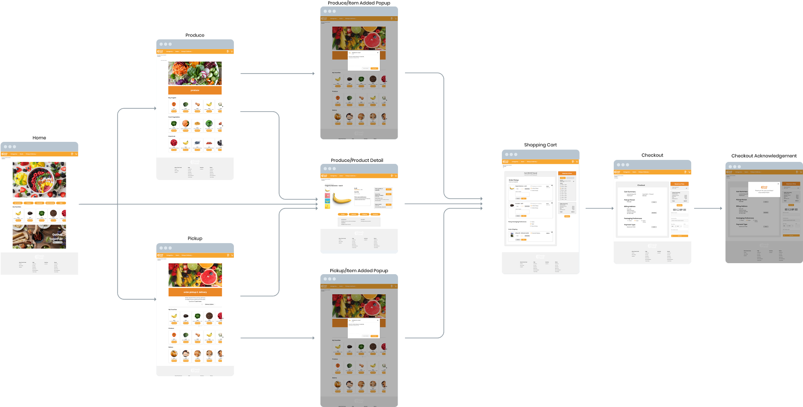
User Flow

Initial Goals
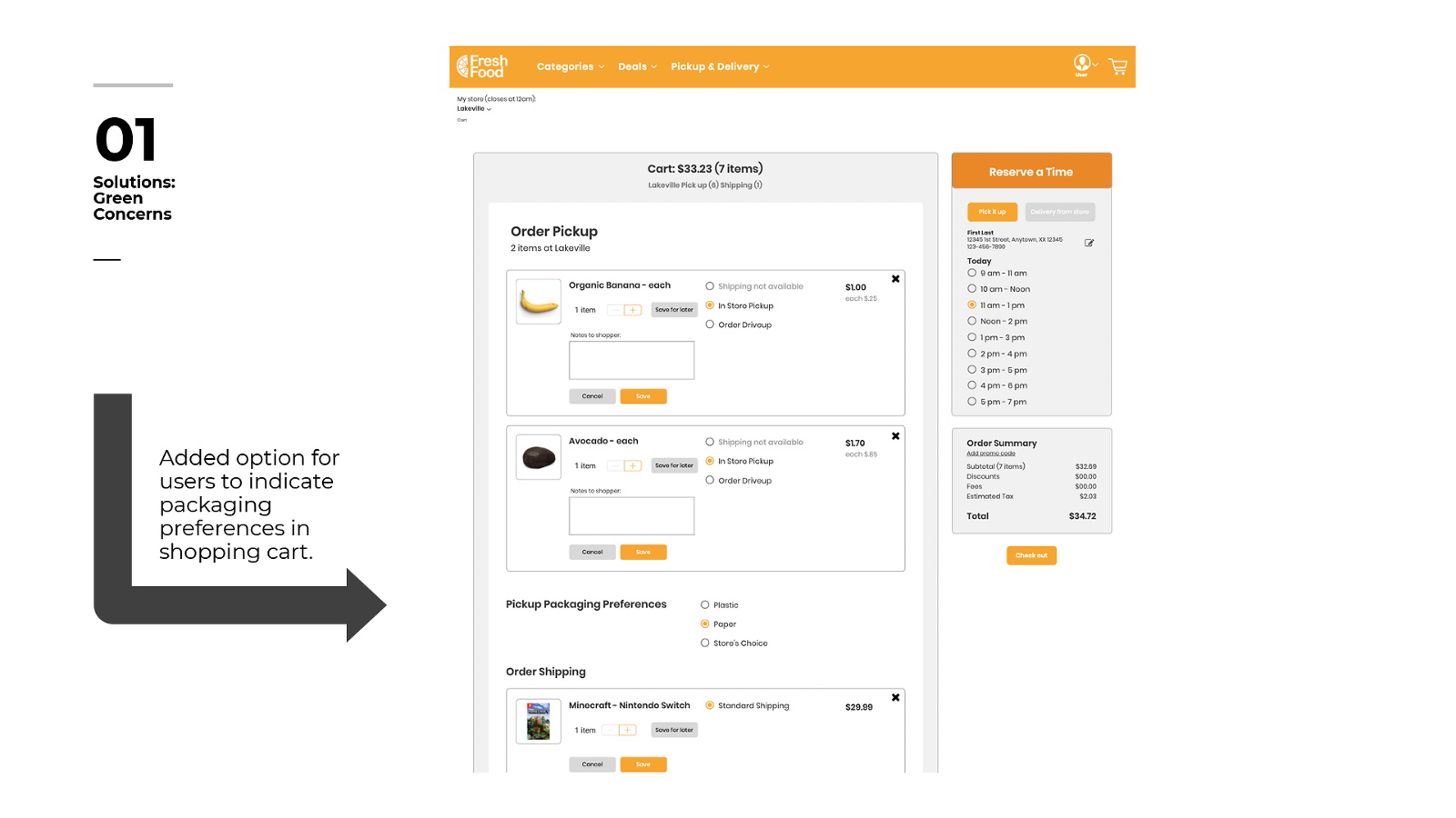
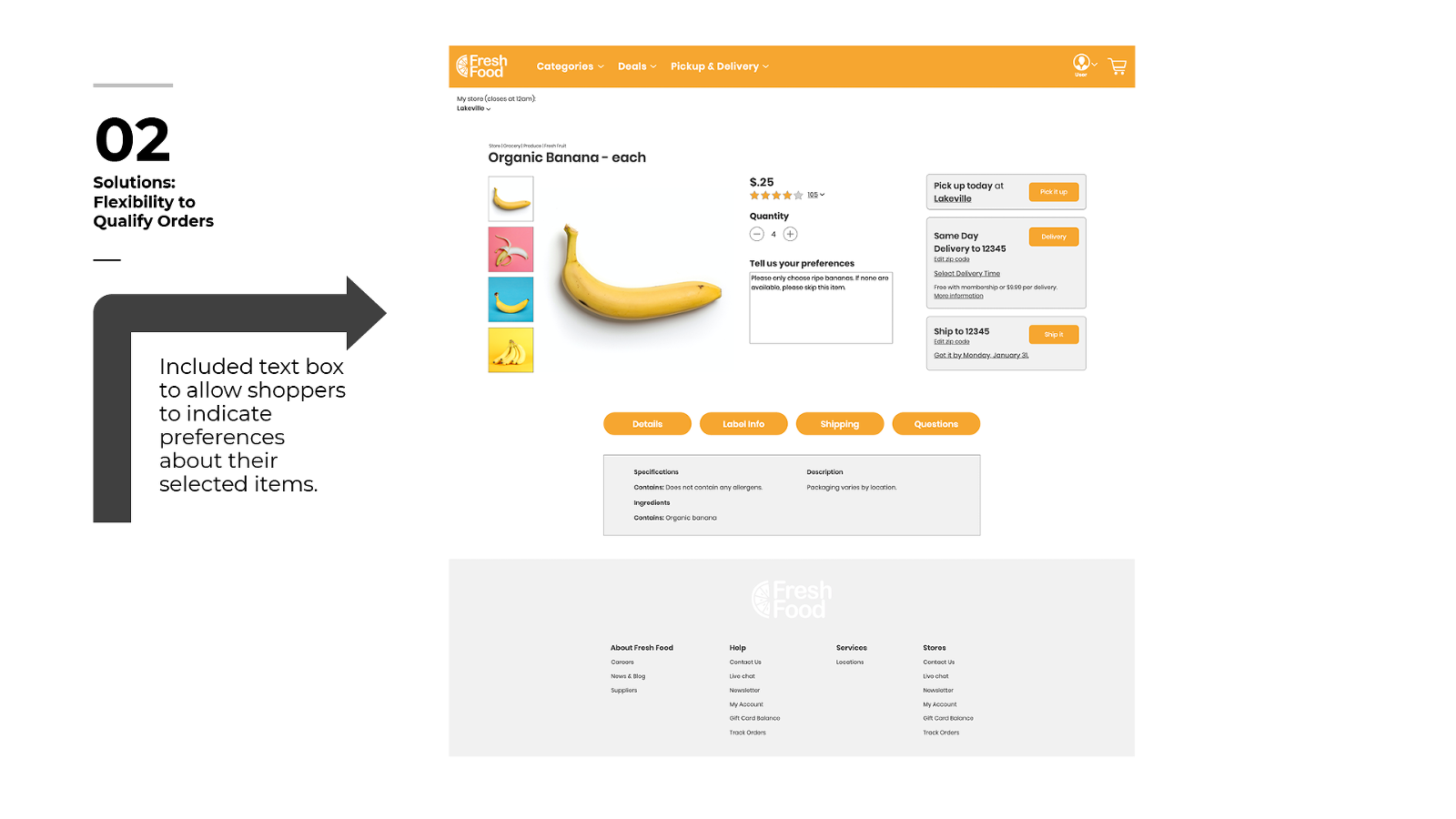
Initial design goals included addressing user flexibility by allowing users to indicate packaging preferences and qualitative notes for shoppers about their food choices.


Recommendations
Insights and recommendations after second round of testing included more opportunities for user flexibility and matching users' existing mental models.
Next Steps
Users quickly identified the kind of app they were engaging with and easily able to navigate through multiple channels to complete their assigned task of ordering bananas while specifying ripeness of the bananas and choosing packaging preferences for pickup.
Opportunities to improve design centered around clarifying items regarding units/quantities of items, option to add replacement products, email information on check out page and way-finding tools on checkout pages.
Additionally, a build out of the Recipes page to allow for users to order ingredients directly through the recipes was seen as a valuable addition to the user experience.


